Monday, March 8, 2010


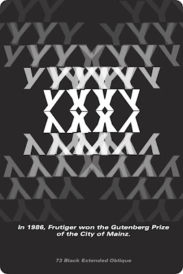
heres the back side


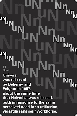
So this is what were doing now. Flashcards of a certain font with facts on them BUT they have to look cool. There is a front and back to each card like an actual deck of cards, but the fact side has to also have the letter and the font. im doing the 26 letters of the alphabet and then 1 number card.

Sunday, February 28, 2010


OK IM THERE. I moved around the water and now it almost looks like a pair of skis or the bottom of a bobsled or something. pretty wintery i think. i still felt like it looked to plain so i added in some drop shadows that worked wonders. YAY


i'm liking this better in black and white but its still missing something. i still like the abstract water reference.


I started playing around with the letters and molding them around. I like what I did with the A's because it looks like mountains which Iraq has. they also kind of look like tents to me? Then i got smart with the 98 thing. Too much? oh well.


So for Baghdad I decided I wanted to use ALL CAPS. i just felt like since they don't even have the same alphabet / language / letters as we do, might as well make it easy to read and simple. I wanted to incorporate the river Tigris, which Baghdad sits on. I started out with this Bank Gothic font and tried to put the olypic colors into the font. its a start.

OK, this happened. I was playing around with making the flower or rings into the state of hawaii, and here it is. I looked at lots of different scripty light pretty fonts and chose this one. i decided to make the 1992 a shadow since there are so many loops, then the rings just feel into place.


ok i was doodling in class and decided to do Honolulu Hawaii as my next capital city. I drew some hibiscus flowers and then in illustrator i created this one. dont know what ill do with it yet.

Friday, February 26, 2010


OK heres frankfurt. i started out making my own font and graduated to this one. im trying to portray a cold city industrial look. i think thats coming along ok.

this is lima so far... i hate the olympic colors and i refuse to gross this up with them. SO, to make it more connected to the olympics i put in the rings in flesh tones. this just reinforces the whole melting pot thing. i moved 1996 up to make the form more enclosed.


This is my (finished?) cape town logo. i listened to the seniors and took their advice with removing the bowl and making the rings the bowl. now the black dot and the rings give a more tribal feel like i wanted initially. also abstractly the entire form looks kind of like a person with their arms out. LIKE

Monday, February 22, 2010


ok this is whats up with frankfurt. theyre known for their skyscrapers so im incorporating that into the letter forms.


ok so next im doing Lima, Peru. I want to incorporate the Nazca Lines (the giant pictures you can see from the sky) and the different ethnicities that make up the "melting pot" of lima. I'm making my own font on this one, making the word Lima resemble the Andes mountains. Woo